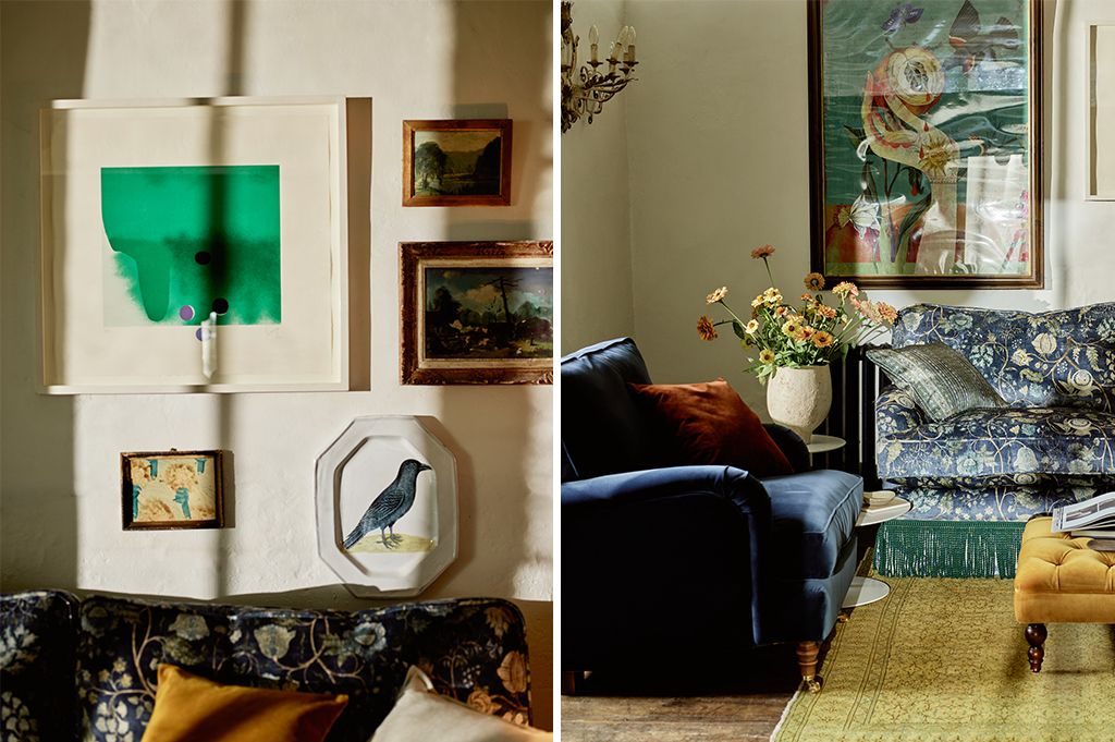
Colour, in all its diverse forms, has been at the forefront of interior design conversations this autumn, and will undoubtedly continue to be a central theme as we head into the new year. But we’re sensing a shift in how colour is being approached in interiors. It’s no longer simply about trends; instead, designers and homeowners alike are focusing on using colour to help create spaces with a deeper emotional resonance and personal connection—elements, indeed, that lead to long-lasting enjoyment.
That said, the need or desire for change will always be there and, therefore, it’s useful to know which shades are sparking fresh ideas among designers and other experts and reflecting what feels current. Colours that were universally popular a few years ago can start to feel a bit tired, and a new range of inspiring palettes emerge that speak to the moods of our time.
We’ve gathered our thoughts on the shades and tones that are capturing the imagination. While much of this direction comes from paint companies, who release their Colour of the Year predictions around this time of year, there are many parallels that can be drawn for fabrics, both for upholstery and for wider soft furnishing uses.
Darker, deeper and comfortingly bold
A common thread across the 2025 colour palettes from major paint brands is the appeal of moody, earthy tones, right across the colour spectrum. Two things seem especially at play: using deeper shades to create rooms that feel like inviting retreats, and a growing desire for self-expression and individuality. These shades bring both character and comfort, with tones that are complex, muddier, and grounded. There is an emphasis on nuanced colours that evoke the soft patina of natural materials and textures, creating a restful but expressive backdrop to a space.
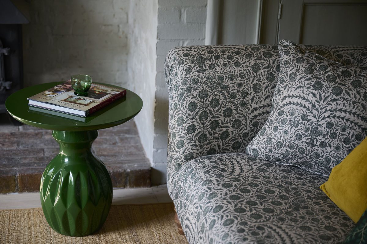
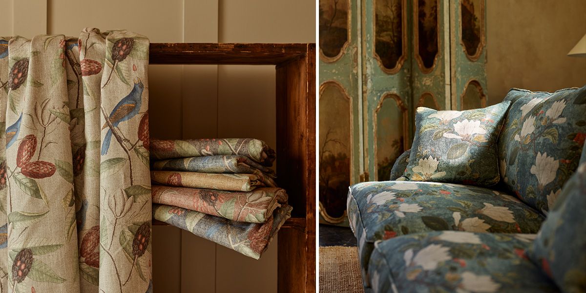
We can certainly find echoes of this direction in our exclusive fabrics, notably in the V&A Threads of India collection and the new companion collection, Threads of India Opulent Velvets collection, which previewed at Decorex this October, and launches early next year. A similar direction can be found in our RHS Botanicals collection. In all of these collections, the printed designs feature a wealth of earthy colours with rich undertones; grounded hues that invite a sense of warmth and natural beauty.
Green revived: olive and forest tones
A perennial favourite during recent years, green, particularly deep and muted shades such as forest and olive, remain rooted. There seems to be a gravitation towards a more a dirtier, more muddied tone too. These greens undoubtedly represent connection to the environment, and their continued popularity reflects the growing emphasis upon interiors that promote well-being and emotional balance. When applied in colour drenched designs, these tones can transform a room into a sanctuary, offering a serenity that transcends any single trend cycle.
Earth tones for sophisticated, yet natural comfort
Earthy tones are already growing in popularity and seem set to continue to do so in 2025. Rich browns, deep reds and warm terracotta are highlighted by many paint companies as colours to explore. It’s a palette that translates beautifully into colour choices for upholstery fabrics too. The deep cocoa in our RHS Botanicals Ferns Toile, for example, melds effortlessly with soft nutty tones, gentle greens and oranges. The feel of the fabric; here it’s a supple linen and viscose blend paired with a luxurious velvet, complements the natural tones.
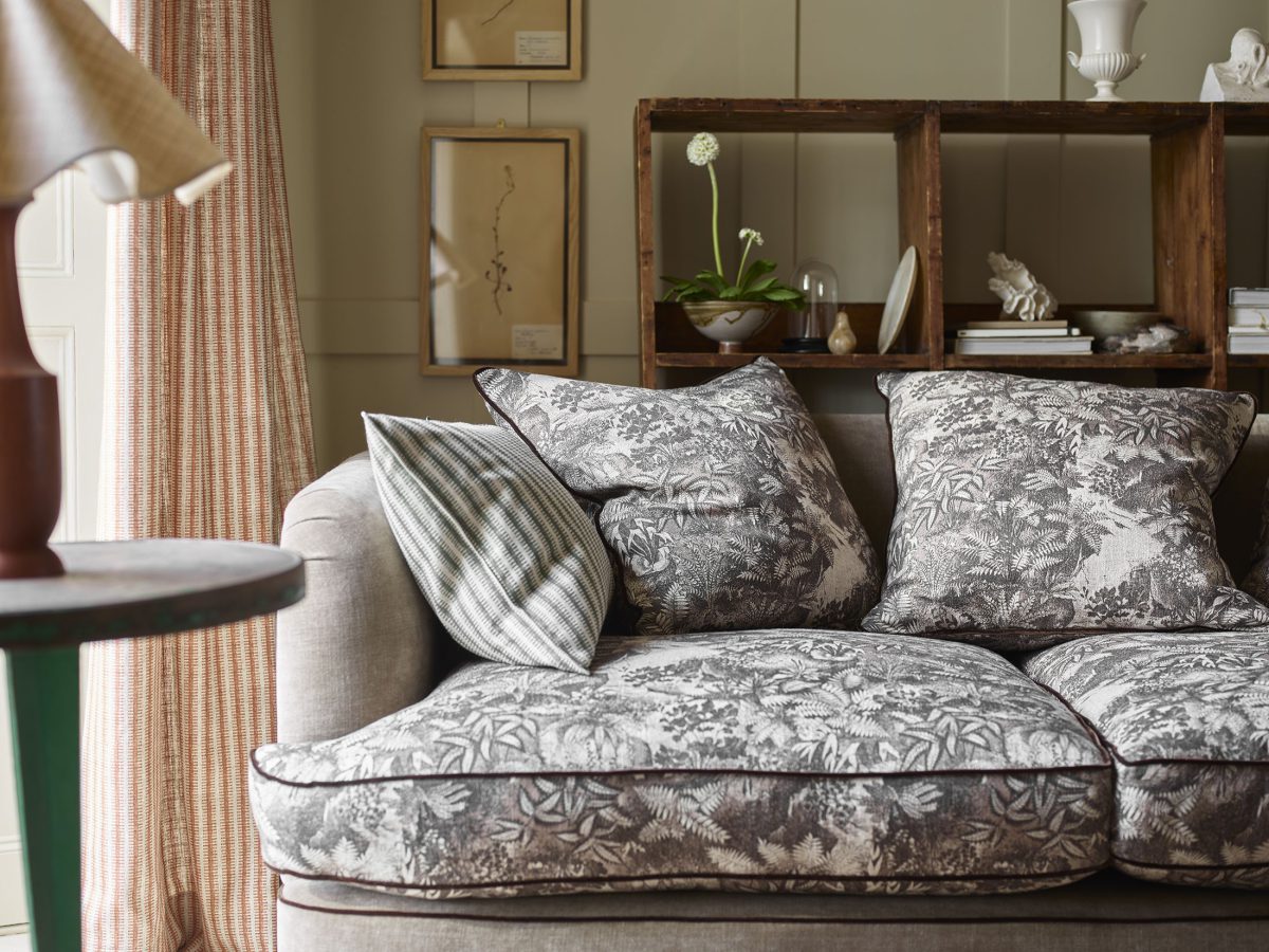
In some cases, this earthy palette rooted in nostalgia, with shades of brown, deep purple, mustard and ginger, reminiscent of 1970s interiors and design, very present once again. Colours that feel both familiar and grounding, that can reflect personal memories and communicate a feeling of connection are definitely in demand.
Soft reds and yellowed pinks
Soft reds, ranging from dusky corals to earthy pinks too are poised to make a significant impact in 2025. The appeal of these hues is how they can balance vibrancy with subtlety. Coral and pink work well as accent colours, but they also work well in a colour drenching approach, They are particularly well suited to living and sleeping spaces where a sense of cosiness is desired, as they soften under natural light. They are as suitable for modern settings as they are for traditional ones, and pair beautifully with other grounding colours such as rich browns or greens, making them ideal for kitchens or spaces with darker cabinetry or furnishings.
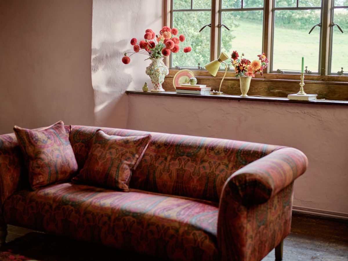
Deep reds are also prominent; a power shade that can offer both drama and comfort depending on its use. Dark maroons and cherry tones are also gaining popularity, adding sophistication without veering too formal.
Richly pigmented colours such as these undoubtedly speak to a growing demand for interiors that reflect personality, and not just seasonal trends. Rather than simply being about the colours of the moment, burgundy, terracotta and earthy pinks, will help form spaces that evoke a sense of the individual who dwells there, creating a characterful environment that feel both refined and comforting, without the worry of fading with the next season’s trends.
Neutrals are getting warmer
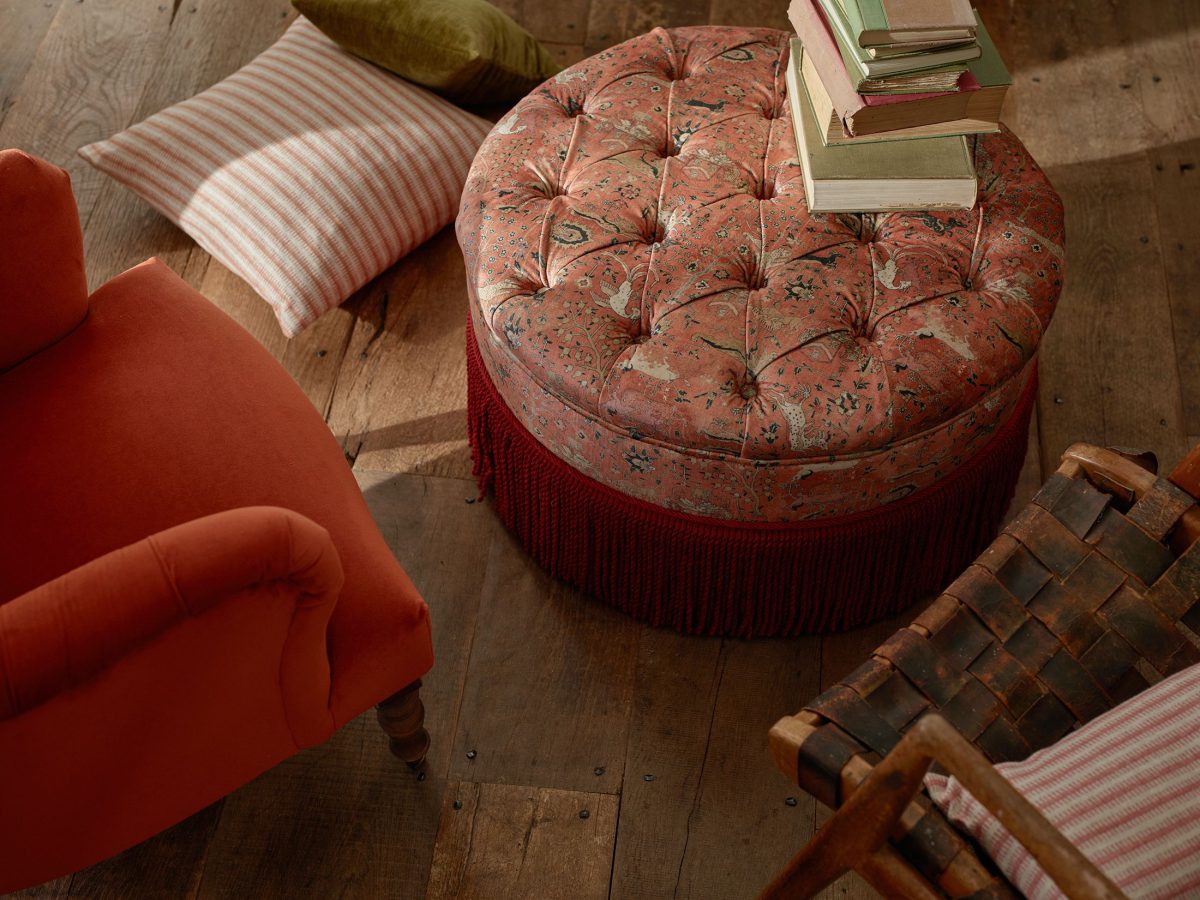
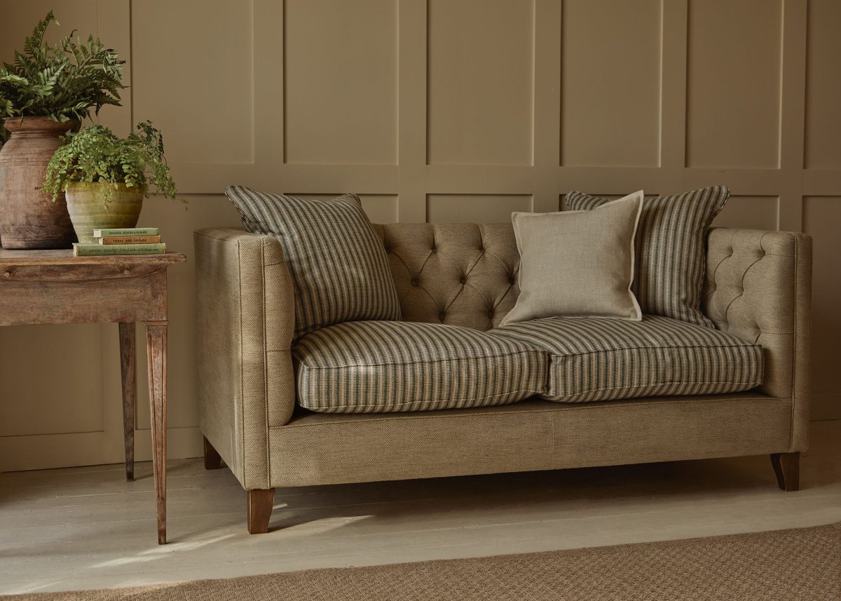
A growing appreciation for biscuit and caramel tones, and earthy stone shades is unmistakable as we move into 2025. As wall colours, these warm neutrals are celebrated for their versatility. They bring a depth to interiors while maintaining the softness needed to keep rooms feeling timeless and approachable. Perfect for creating intimate living rooms and hallways, where a sense of welcome is essential.
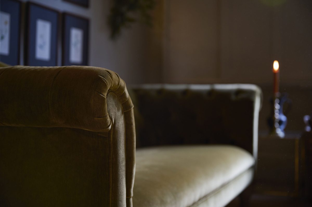
In upholstery and soft furnishings, warm neutrals are equally transformative. Think textured weaves or linens in tan, biscuit or creamy hues for sofas, layered with velvet cushions to bring richness and warmth into living spaces. It’s a simple palette that is particularly suited to enhancing wood furniture and natural materials, to build harmonious, cohesive interiors. With high-quality neutrals, designed for durability well as beauty, you can easily design with both relevancy and longevity in mind.
Strategic pops of lightness or brightness
Interestingly, many paint brands are leaning into a splash of brightness to add energy to deeper hues or to a neutral palette. Dulux has denoted a sunny yellow, named True Joy™, as their headline colour for 2025, tapping into what they identify as ‘ desire to bring that optimism right into the home. An uplifting yellow like this works especially well as a striking accent colour to complement more subdued shades, and balance out the earthy tones that are so popular and widespread. It’s an approach that will work just as well with upholstery as with paint.
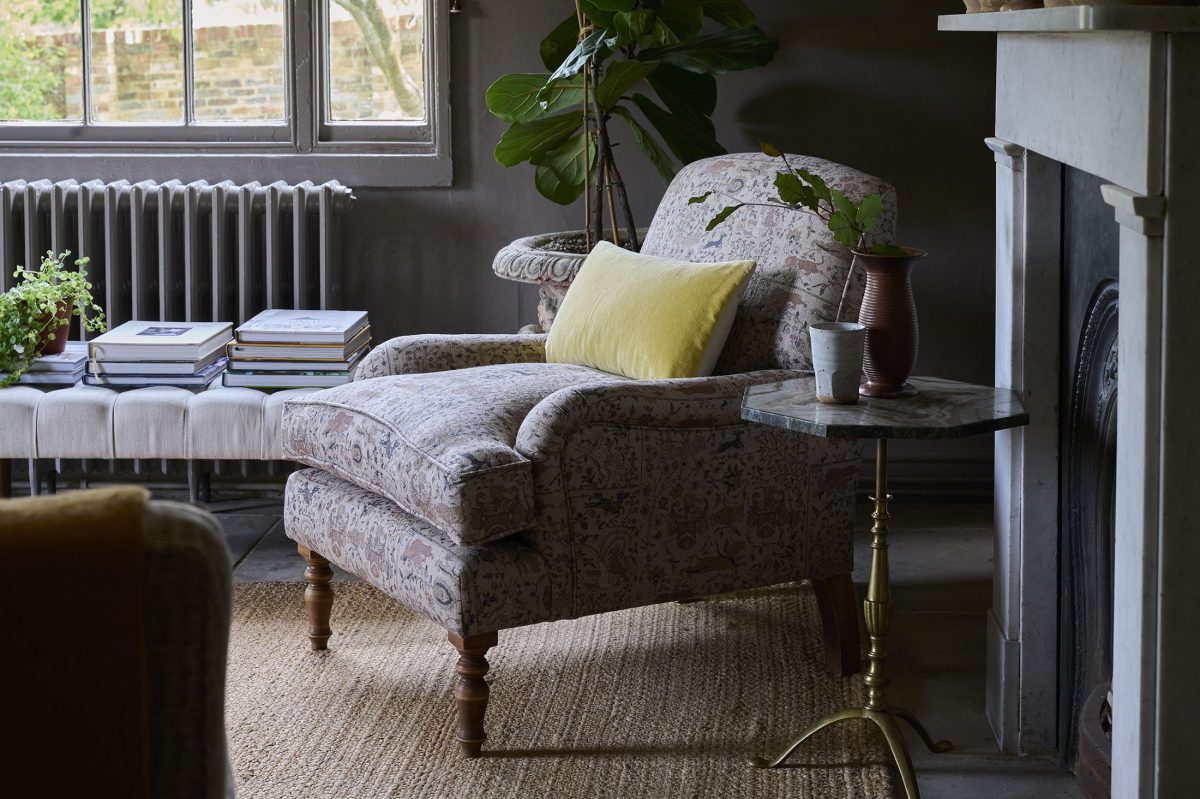
Golden yellows undoubtedly bring an inviting richness to interiors, evoking a sense of cheer. The growing popularity of yellow, be it golden or mustard in tone, or a more citrusy punch, is not simply about trend, but reflects a desire to use colour to enhance emotional well-being. Highlights of any bold colour in a design can create a space that feels dynamic, yet deeply personal.
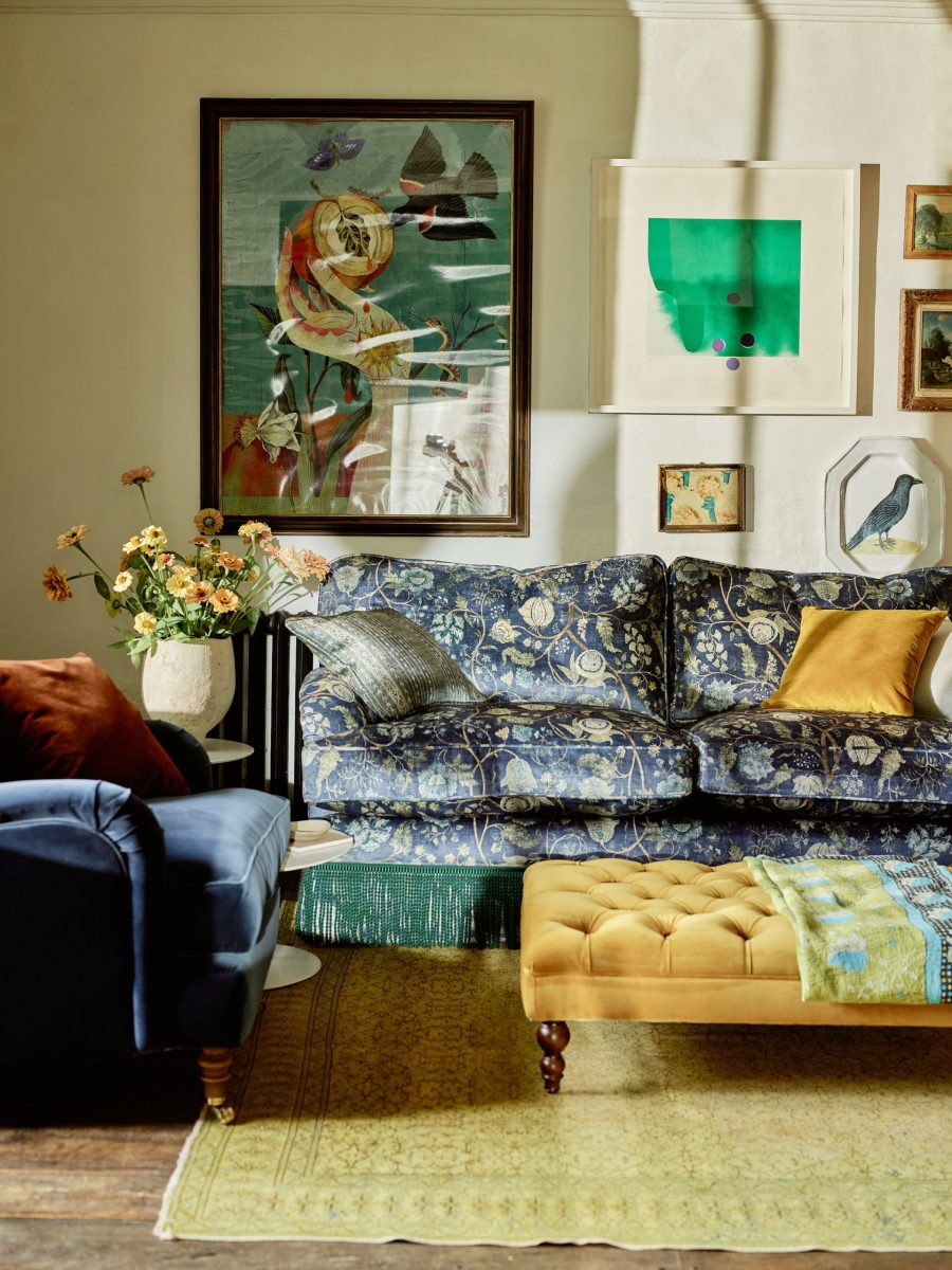
Using key elements from the 2025 palette to create a meaningful home
The 2025 paint colour trends present a wealth of inspiration for creating thoughtfully curated interiors that balance personal style with timeless appeal. Darker shades like cocoa brown, navy, burgundy, or plum lend themselves to creating cocooning spaces that feel deeply relaxing, perfect for living rooms or snug areas. Meanwhile, warm neutrals and earthy tones with pink or orange undertones bring an inviting energy to spaces, offering depth without being jarring.
One of the most exciting techniques for tying wall colours and fabric choices together is colour drenching — where walls, ceilings, and woodwork are painted in a single shade or tonal variations for a seamless, enveloping effect.
Ruth Mottershead, the Creative Director at Little Greene explained how ‘double drenching’ with paint colour is bringing a new dimension to interiors:
“As we move into 2025, we’re seeing increased understanding of the effect colour can have on the atmosphere of a space… ‘Double Drenching’ takes the ‘Colour Drenching’ concept onto a highly creative, sophisticated and nuanced level, enabling you to add unexpected contrast to modern homes where architectural detail is lacking, or draw attention to more classical architectural elements within period properties. This approach is all about fully enveloping a space, embracing the power of colour to dramatically transform an interior and provide a captivating backdrop for your home.”
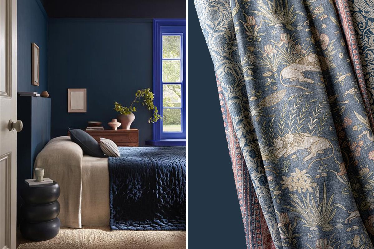
Upholstery fabrics, too, can play a pivotal role in this look. A plush velvet sofa in a matching or slightly lighter tone to the wall colour will amplify the cohesive feel, while a patterned or textured woven fabric will add subtle interest without disrupting the unity of the palette. Curtains, cushions, and other soft furnishings in complementary shades can reinforce the effect, creating a harmonious and immersive aesthetic. Conversely, an occasional chair or footstool in a strongly contrasting, ‘unexpected’ accent colour will enliven a scheme with playful personality. Whether embracing dynamic contrasts, tonal layering, or immersive drenching, the focus remains on creating spaces that resonate with personality while fostering an enduring sense of comfort.
With our extensive range of exclusive fabrics, from classic velvets to intricate prints, and endless customisation options, we’re here to help you design furniture and soft furnishings that perfectly complement your chosen colour palette. Visit our showrooms to explore the possibilities in person and seek the support of our expert design consultants, who are on hand to help bring your vision to life.

